

EVA AIR Website Design
Branding the high-quality flight service and building a seamless journey experience
Statement
Ranking in AirlineRatings' World's safest airline, the Taiwan airline company EVA AIR is renowned for its high-quality services and friendly staff. However, the official website and mobile app were still traditional. It was hard for the customers to find their needs. The decent services also have not reflected online.
In addition to the brand and usability problem, new rules have required the US and foreign carriers to make the web core functions to be accessible to individuals with disabilities. The core functions must comply with the W3C’s Web Content Accessibility Guidelines (WCAG) 2.0 levels A and AA by November 2015.
The project aimed to research and redesign the customer’s experience to represent the brand image. The scope covered the homepage, information architecture and the travel management features.
Role
User research
Interaction Design
IA Design
Project Communication
Timeline
Mar.2015-Jun. 2015
Challenge
The gap between the brand image and the online service
As the first impression of the brand, the corporate identity system of EVA AIR website was not distinct enough. The interviewees pointed out the primary colors, and the secondary color of the website - the baby green and the baby pink made them feel inconsistent with the brand image. While EVA AIR has a group of the loyal members, the site didn't take advantage of the loyalty to strengthen the member services and tailor the needs.
Lost in the complicated information architecture
The site intended to provide the information and the features as detailed as it can. In contrast, the users usually got lost in the large mega menu with its 144 items and failed to find the functions by themselves. According to the interviews, the users only used 10 items among the 144 items of the mega menu. As a result, it costs time and money to assist the customers with the customer support hotline.


Hard to manage the trip online efficiently
It's crucial for the traveler to be able to manage their trips online effectively. The itinerary management feature mixed the information and the functions, caused the complexion for the travelers to track their tasks before boarding.
Need to meet the WCAG 2.0 AA standard
By November 2015, new rules have required the US and foreign carriers to make the web core functions to be accessible to everyone. The features including but not limited to the booking system, frequent flyer accounts, itinerary management must comply with the W3C’s Web Content Accessibility Guidelines (WCAG) 2.0 levels A and AA. With the limited resources, it's a new challenge for the design and engineering team to learn and build the site to be both accessible and aesthetic.

User Research
How to probe the problems and gain the insights in a limited time?
To obtain the insights to fuel the innovation within two weeks, we decided to focus on customers' brand identification and their attitudes and behaviors of itinerary management. Therefore, I led the team to design four tools for the research: interview, think aloud - observation, card sorting, A/B test. It was the first time for our team to learn to design research frameworks. I believed this designed tool would help to enlighten us by the travelers' journeys.

-
Screening from 30 surveys, we selected seven different types of the travelers for the 2-hr in-depth interview.
-
To understand the travelers' perception of EVA AIR, different mindset of the different trip types, the context of the user journey and the awareness of the brand loyalty.

-
Ask the interviewees to demonstrate their using scenarios and the process to understand the motivations, experiences, and the judgments of the promotion
-
Set up the observation zone and invite the stakeholders from EVA AIR to join the interviews. They were very shocked when they learned the real reactions from the travelers.

-
To simplify the megamenu, I printed out all the 144 items from megamenu. We first asked the interviewees to figure out the most frequent tasks they used to complete online.
-
Then, they needed to categorize, prioritize all the 144 pieces from the menu and explain. From here, we identified the importance of the features and the readability of each term.

-
To examine if the new website structure can help the users complete their tasks, we asked the interviewees to operate the new site menu prototype to see if he can easily find out the primary functions identified by himself previously.
 InterviewEach interview, we had 3 parts including interview/prototyping to explore interviewees' value,feeling,behavior. |  Card sortingWe asked the interviewee to sort 144 items of the current mega menu to understand the accessibilities of its wording and functions. |  User testingAfter building the structure, he was inquired to explain his thoughts and obstacles. |  Usability testingIn usability testing, we designed the tools to record the mouse tracking as well as the interviewees' facial expressions without distracting them. | 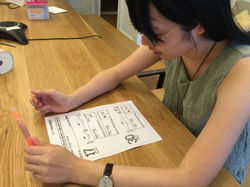 A/B testPaper prototype test. Digital version prototypes are also available. |
|---|---|---|---|---|
 A/B TestInterviewees were asked to use Interactive prototype and share their thoughts of the new concepts. |  Paper prototypeFor each main function, we displayed 2 or 3 paper prototype concepts to quickly test the usability. |  Built the sturctureAnalyze the data |  PresentationDiscuss with clients using the prototype |  WireframeDetail design |
The functions of the website need to link closely to the purposes and scenarios of the passengers
Whether he is a business traveler or a tourist, they come to the airline website to complete the tasks. Therefore, the website design should always connect to the user scenarios.
Interviewees said: "I hate to be trapped in the homepage and still fail to find the entrance to complete my tasks." The 144 entrances of the home page menu also heavily distract the users from finding the right gate.
The website service had not bridged the gap in between the traveler's journey
From this graph, it's clear that ranging from the tracking ticket prices, managing itinerary to managing mileage, there were still several gaps between the existing services and the customers' journey. The redesign opportunity lies in assisting the trip seamlessly with the digital customer services.


80% user experience comes from the 20% essential tasks
Booking flight tickets, checking-in online, monitoring flight status, selecting meals & seats, and managing mileage are the most commonly used 20% functions, which already include 80% user experience. Optimizing these 20 % functions will significantly improve the clients' satisfaction
Journey

Get lost in the website
"It's very annoying for me to get lost in the official website when I just wanted to check in! I really hate to queue in the airport so I'll make sure I check in before boarding." - 27-year-old engineer, Miss Wu, travel 2 times a year.
"There are 144 items in the menu!? I usually don't use them...and I have no idea about many terms. Take this one for example, what does the “Tarmac delay plan" mean?"
- 35-year-old designer, Mr. Huang, travel 1 time a year.
Most people know little about the mileage plan, it is also difficult to manage the mileage
"Sometimes I just want to see the number of the mileage. But it always a trouble for me to get my membership number back and log in to the website. Even when I log in to the member profile successfully, it takes me a while to find the mileage information. "
- 31-year-old faculty member Mr. Hu, travel three times a year
"I heard that accumulating miles is beneficial, but I guess it's hard to earn and redeem the miles. Right?"
- Miss Wang, 30 years old, travel twice a year.
Feel stressed before boarding. Worry anything will go wrong
"Before boarding the plane, I always feel anxious even I have traveled around many times. I'm still afraid there is anything like seat selection, meal selection that I have not arranged yet."
-31 years old, Mr. Hu, travel 3 times a year.
"I'll always ensure to check if I have registered my membership to this trip. I had a very bad experience last time when I tried to record the miles after the trip."
- Miss Wu, a -27-year-old engineer, travel twice a year.
The promotion banners on the website are not attractive. They have nothing to do with me.
"It's impossible to buy the ticket at the lowest price as the promotion showed. If it didn't declare the applicable conditions clearly, I don't believe it."
- 34-year-old university lecturer Mr. Shi, travel four times a year.
"I won't click on the promotion banners on the official site. I usually come to EVA AIR site to buy the ticket after comparing the price of the third party website. How would I change my destination just because of the advertising?"
- 30-year-old designer Miss Huang, business traveler, travel 10 times a year.
Users' pain points
Effective Promotion
-
原本首頁廣告雜亂且令人忽略
-
研究發現能吸引使用者的促銷廣告必須在第一眼提供明確的地點價位、清楚的票價條件。引人入勝的照片與明快的call to action 能促使轉化率

-
快速入口模組針對不同需求
-
對一般人最重要的訂票、航班動態模組
-
對已購票者最重要的報到、行程管理、會員里程管理模組

Design Concept
The grand journey has kicked off from the moment you opened the website
Make the passengers immerse in a simple, convenient and fascinating digital experience as enjoying the cabin service.
Homepage
The selected hero image represent the positive spirit

-
The hero images should be able to convey the core value of EVA AIR - friendly, well-rounded, localized and professional.
The attractive advertising copy
-
On the first screen, the website must display clear fare conditions, tax, clear place names along with the prices.
-
Attractive photos and call to action buttons increase clickthrough rate
Multiple layout combinations that vary according to different locations and needs

-
To fit the localization needs of different countries' marketing strategies, we designed 8 modules that can be used to different layouts.
-
Provide different layouts to meet different national advertising regulations
Get things done with the shortcuts
-
The shortcuts modules on the homepage allow the user to perform tasks immediately.
-
The shortcuts include online booking, online check-in, flight status, seat & meal selection, and mileage management.


Instant flight and mileage summary for members
-
Stay logged in and view the relevant flight information. Easy to keep updates with the mileage information.

Trip Management
Manage the trip easily with
the simple and clear information cards


-
Get things done - clear status
-
Clear hierarchy to manage every trip
-
Manage passengers information in group
-
Ensure the travelers' membership are connected
-
Additional useful information to remind the travelers
Seat / meal selection
Let's fly together - improve the group trip management process

Detailed seat information
The detailed seat information with the amenities makes it clear to make decisions.

Want to be accompanied
The icon on the seat map clearly indicates the person who travels together, making it easier to select multiple seats.

Let's share the meal
Friends and family like to share food when they travel together. New design allows users to see the meals selected by the companions.

Meals look delicious
Meals are one of the most valued on-board services for passengers. EVA offers meal selections to all cabins. The beautiful pictures make the travelers look forward to the trip.
Membership
The real-time, clear itinerary and mileage summary

Result and reflection
It was my first time to work with EVA Air, one of Taiwan's largest aviation brands. Being in the shoe of the EVA AIR to think about its brand identity and recognize the target customer was a very distinctive experience.
Slightly different from the past, this time we used many prototypes to discuss with customers, from the paper sketch, paper prototypes to interactive prototypes. The different fidelity of the prototype helped us to communicate the ideas effectively.
Moreover, this is the first time the team has thoroughly studied the WCAG 2.0 (The Web Content Accessibility Guidelines). Devoting ourselves to achieve inclusive design is not only to be in line with the US aviation industry regulations but a belief that everyone has the right to be accessible to the excellent design. Although during the developing process, we needed to discuss back and forth on some features to make a trade-off, we believe that it is more vital to make the website accessible to everyone than making a "beautiful site" but only available for the majorities.
Aside from this project, I had the opportunity to rethink about how to make customers be on the same page with us. To gain the convincible insights, we created many tools that we had never tried before. This experimental process leveraging the tools was new to the team. It also laid the foundation for other projects on the user research process.
What can be done differently:
The UI design has outsourced to another design company. Because we had no chances to communicate the visual style adequately, the results didn't wholly represent our UX design. This case taught us it's better to design UX and UI at the same time and work more closely together, to bring out the best results.