

EVA AIR Website Design
Branding the high-quality flight service and build a seamless journey experience
傳遞品牌意念與串連旅程經驗的官網
Statement
Ranking in AirlineRatings' World's safest airline, the Taiwan airline company EVA AIR is renowned for its high-quality services and friendly staff. However, the official website and mobile app were still traditional. It was hard for the customers to find their needs. The decent services also have not reflected online.
In addition to the brand and usability problem, new rules have required the US and foreign carriers to make the web core functions to be accessible to individuals with disabilities. The core functions must comply with the W3C’s Web Content Accessibility Guidelines (WCAG) 2.0 levels A and AA by November 2015.
The project aimed to research and redesign the customer’s experience to represent the brand image. The scope covered the homepage, information architecture and the travel management features.
長榮航空向來以本土、親切、優質且安全的飛航服務獲評為台灣人心目中最優質的航空。然而網站和app仍非常傳統,並且未能有效連接旅客服務。專案目標將機艙內高品質的品牌形象,延續到線上服務,進行使用者研究、架構與wireframe設計。優化首頁與行程管理功能,同時也在2015年底,即領先因應全球航空業須於2016年符合WCAG2.0無障礙規範AA等級。
Role
User research
Interaction Design
IA Design
Project Communication
Timeline
Mar.2015-Jun. 2015
Challenge
The gap between the brand image and the online service
品牌與線上服務的斷差
As the first impression of the brand, the corporate identity system of EVA AIR website was not distinct enough. The interviewees pointed out the primary colors, and the secondary color of the website - the baby green and the baby pink made them feel inconsistent with the brand image. While EVA AIR has a group of the loyal members, the site didn't take advantage of the loyalty to strengthen the member services and tailor the needs.
官網首頁作為第一線與顧客接觸的平台,網站上調性色彩混亂、品牌精神薄弱,無法延伸顧客對於「長榮航空」的好印象。EVA乘客的特性是品牌忠誠度較高,也相對重視會員服務。現有的網站對於已登入的會員,尚未提供更優質、親切的服務,個人化與深度有許多不足之處。
Lost in the complicated information architecture
使用者迷失於複雜的資訊架構
The site intended to provide the information and the features as detailed as it can. In contrast, the users usually got lost in the large mega menu with its 144 items and failed to find the functions by themselves. According to the interviews, the users only used 10 items among the 144 items of the mega menu. As a result, it costs time and money to assist the customers with the customer support hotline.
首頁功能齊全,龐大的資訊架構與選單共有144個項目,經過研究,經常使用的功能卻不到10項。過多的選項令使用者找不到所需的重點功能,降低了使用評價滿意度,也令使用者無法自行解決問題,導致須花費人力處理客訴。
Hard to manage the trip online efficiently
難以有效線上管理個人行程
It's crucial for the traveler to be able to manage their trips online effectively. The itinerary management feature mixed the information and the functions, caused the complexion for the travelers to track their tasks before boarding.
線上報到、選位選餐等行程管理功能是已購票旅客最在意的功能,而現行的行程管理頁面把所有的資訊混雜在一起,旅客無法從中一目了然得知航班狀況與選位、報到等任務完成的程度。
Need to meet the WCAG 2.0 AA standard
需通過無障礙網頁評等AA級
By November 2015, new rules have required the US and foreign carriers to make the web core functions to be accessible to everyone. The features including but not limited to the booking system, frequent flyer accounts, itinerary management must comply with the W3C’s Web Content Accessibility Guidelines (WCAG) 2.0 levels A and AA. With the limited resources, it's a new challenge for the design and engineering team to learn and build the site to be both accessible and aesthetic.
2015年底前,飛經美國航線之航空公司皆需通過WCAG2.0無障礙規範,包含首頁、訂票系統、重要行程管理功能。如何設計一個兼具美觀、無障礙的網頁,對程式端與設計端都是個挑戰。


User Research
如何在短時間內透過使用者研究挖掘問題、找尋洞見?
專案的範圍是首頁和行程管理,屬於任務明確的頁面。
因此,我們思考的是如何在兩週內,有效找到品牌價值-行程-網站-服務的脈絡與概念方向。決定聚焦在提升品牌形象與掌握行程,設計了四種主要的工具來實作,同時這也是團隊內第一次有結構性地運用訪談與分析的工具。透過七位受訪者,訪查旅客在旅程的開端,帶著不同的心情經歷旅程,在每一項選擇透露出來的價值觀、與搭乘經驗。

-
問卷、電話初訪後,篩選出7位不同類型受訪者,進行2小時深訪
-
了解品牌價值印象、航途類型、User journey脈絡與顧客忠誠度

-
受訪者演示現有網站使用流程,理解使用動機、體驗、對品牌、廣告的感受
-
同步轉播錄製臉部與使用軌跡給客戶看,接收真實意見的衝擊

-
結構重組小卡,理解龐大的megamenu如何影響使用性
-
將megamenu上144個功能拆解,請受訪者依重要性排序與分組,了解障礙與用字語意理解度

-
請受訪者依其選出的重要功能,使用兩個不同主選單prototype傾聽回饋與期待
 InterviewEach interview, we had 3 parts including interview/prototyping to explore interviewees' value,feeling,behavior. |  Card sortingWe asked the interviewee to sort 144 items of the current mega menu to understand the accessibilities of its wording and functions. |  User testingAfter building the structure, he was inquired to explain his thoughts and obstacles. |  Usability testingIn usability testing, we designed the tools to record the mouse tracking as well as the interviewees' facial expressions without distracting them. | 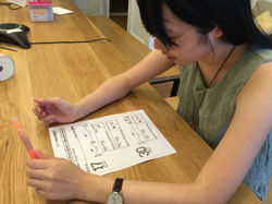 A/B testPaper prototype test. Digital version prototypes are also available. |
|---|---|---|---|---|
 A/B TestInterviewees were asked to use Interactive prototype and share their thoughts of the new concepts. |  Paper prototypeFor each main function, we displayed 2 or 3 paper prototype concepts to quickly test the usability. |  Built the sturctureAnalyze the data |  PresentationDiscuss with clients using the prototype |  WireframeDetail design |
網站功能需和旅客目的與情境緊密串連
不論是商務旅客或旅遊客,他們來到航空官網都有其必須完成的任務,所以網站設計必須將使用的情境與時機緊密串連。
受訪者說:「我最討厭在首頁的選單找來找去都找不到我要的那個功能」。144個項目的首頁選單,也讓使用者迷失。


網站未能緊密結合旅程中的需求
從追蹤機票價格、旅途行程管理到會員里程服務,旅客在每個接觸點需要的服務,仍然多於長榮官網現有服務。設計的機會點在於藉由數位服務將旅程串連得更完整。
20%的重要任務涵蓋了80%的使用經驗
線上訂機票、線上報到、查詢航班動態、選位選餐、查詢里程數是最常用的20%功能,涵括80%使用者經驗,優化這20%的服務,將能大幅提升使用者的滿意度。
Journey

What troubled passengers are more than we know
抱著明確目的來網站,卻在網站迷路
「我最討厭要找個報到,首頁繞來繞去找不到。很討厭在機場排隊報到。」-27歲 工程師吳小姐 一年出國2次
「選單有144個喔!?我都沒用誒,而且很多都看不懂。...像這個機坪延遲計劃就不知道是什麼。」
-35歲 設計師黃先生 一年出國1次
大部分人不懂哩程,懂里程的人仍然覺得很難查里程
「有時候只是想看一下里程數,要登入又記不起卡號密碼,登入了又要點很多次才能找到里程在哪裡,滿麻煩的」-31歲 教職胡先生 一年出國3次
「聽說收集里程不錯,但感覺應該很難換到」-30歲 業務王小姐 一年出國2次
登機前心理壓力大,怕安排有疏漏
「即使出國很多次,不到上飛機還是怕有什麼報到、選位之類的事情沒做好。」 -31歲 教職胡先生 一年出國3次
「一定要看有沒有登到會員,上次補登里程經驗超不爽。」
-27歲 工程師吳小姐 一年出國2次
網站旁的優惠訊息標示不清
與我無關
「一定買不到,每次點都沒票,沒寫出適用條件都假的啊」-34歲 大學講師施先生 一年出國4次
「我不會去點它,已經知道要去哪了才來官網,怎麼會因為廣告就中斷改變你要去的地方」-30歲 設計師黃小姐 一年出國10次
Users' pain points
Effective Promotion
-
原本首頁廣告雜亂且令人忽略
-
研究發現能吸引使用者的促銷廣告必須在第一眼提供明確的地點價位、清楚的票價條件。引人入勝的照片與明快的call to action 能促使轉化率

-
針對不同國家行銷策略的需求,設計共8種可組合搭配的版型,作為品牌、促銷、與相關消息的接觸點
-
依據不同國家廣告規定露出的資訊字樣提供不同版型

因地制宜的多種版面組合
-
快速入口模組針對不同需求
-
對一般人最重要的訂票、航班動態模組
-
對已購票者最重要的報到、行程管理、會員里程管理模組
會員即時便利的航班與里程摘要
-
登入後保留登入,顯示相關飛航資訊、對於會員提供一目了然的里程資訊,有效管理。


Design Concept
從點開官網的那一刻就開啟一段超棒的旅程
為長榮航空的旅客,帶來充滿旅程感、便捷迷人的網站服務平台,如同卓越貼心的客艙服務
Homepage
開闊大器的首圖
傳達長榮正面形象

-
首頁Hero image選圖需能呈現EVA形象-親切、本土、細膩服務
贏得消費者信任
想點進去的廣告
-
透過訪談研究找出使用者會感興趣、有效的機票促銷廣告設計關鍵,在於第一屏就必須顯示明確的票價使用條件、清楚的地名價格。
-
吸睛的照片和call to action按鈕可有效提升點擊率
捷徑完成最重要的任務
-
使用者來到官網是來完成事情的,快捷的核心任務區塊讓使用者不迷路
-
核心任務區塊:線上訂票、線上報到、查詢航班動態,以及已購票者的選位選餐與里程數呈現

Trip Management
簡潔明快的旅程卡片,讓飛行前的待辦事項輕鬆多了


Seat / meal selection
簡單的預定步驟,更便利多人一起選擇

座位資訊更詳實
靠窗靠走道,使用者在意的其實更多,詳實的座位資訊讓選位更放心

就想賴著你
座位圖上清楚標註同行者代號,多人分配座位更方便

你的餐點我也嚐嚐
難得一起出遊,使用者有共享美食行為,選餐系統讓使用者能看得到同行者的選餐,選擇不同餐點一起嚐鮮

菜餚圖片令人期待
餐點是旅客最看重的機上服務之一,長榮獨家提供所有艙等選餐,視覺化的選餐頁面讓旅客還沒上飛機就懷抱期待
Membership
會員即時便利的行程、里程摘要

Result and reflection
首次有機會和台灣最大航空品牌之一長榮航空合作,相當有趣,跳脫旅客的身份,從航空公司的角度去思考傳遞品牌的精神、挖掘目標客群。這個專案讓我有機會實現一種對於設計過程的「再設計」,不斷思考如何透過精心設計的橋段讓客戶和我們站在同一陣線。我們用了不曾使用過的工具,找出insights,對於我自己、和團隊都是一種嘗試,也為之後的其他專案開啟「設計就是要這樣做」的刺激。
稍稍不同於以往臻於至善才能呈現給客戶的簡報形式,這次運用了相當多prototype和客戶討論,從靜態手稿、到紙張模型、到數位原型,工具有彈性,才能適應專案的彈性。
同時,這也是團隊第一次深入研究WCAG 2.0無障礙設計規範。實現無障礙規範對我來說,其意義並不只是在符合美國航空業條文規範,而是一種實現人人都能享受好設計的信念,或許在過程開發團隊與我們都不得不受限而反復琢磨妥協,但我們更相信能夠讓不同障礙類別,都順利地使用網站完成購票、行程管理任務的意義更大於一個「美麗的」網站,也不啻為平權貢獻心力。
順利交付UX文件後,UI設計由客戶另外發包給其他團隊。因為缺少能夠充分溝通視覺呈現風格的機會,導致後來上線的呈現樣貌和原本wireframe規劃有相當大的出入,這是我們設計團隊感到很可惜之處,也讓我們體認UX和UI設計能夠由同一個團隊緊密合作,才能相輔相成,更臻完美。